• Hey, guest user. Hope you're enjoying NeoGAF! Have you considered registering for an account? Come join us and add your take to the daily discourse.

My Little Pony FiM Community [OT3] Surely You Saw This Coming

PaulloDEC

Member
As for the episode titles issue, perhaps you could do what the Clone Wars episode guide does and have a highlight effect instead of making the recommended episode titles a different color.

Gave it a try.

RxFb.jpg

Personally I think the prior version works a lot better. This one feels a lot more visually noisy to me, which is dangerous given how detailed the thing already is.

I think the different coloured text is enough, honestly.
 
Gave it a try.


Personally I think the prior version works a lot better. This one feels a lot more visually noisy to me, which is dangerous given how detailed the thing already is.

I think the different coloured text is enough, honestly.

Yeah, I suppose highlights work with Clone Wars because a lot fewer episodes are highlighted, the descriptions are off to the side, and the lower tier of recommended episodes get annotations. Perhaps the pictures will be enough to separate the recommended episodes; I did think the previous version was easier to follow once they were added.

I suppose you can go ahead and make the rest of the seasons when you're ready. Remember to label the tops with the season numbers. I'm thinking the guide introduction should be a separate image now--only a bit will be explaining how to use it, the rest will be explaining how episodes were selected. Also, should we include Belle Eve in it, since she's PonyGAF's mascot? Maybe even just the picture in this thread's OP.

EDIT: My Lego Pony: Dental student, a kind of neat lego-style short.
 

PaulloDEC

Member
I suppose you can go ahead and make the rest of the seasons when you're ready. Remember to label the tops with the season numbers. I'm thinking the guide introduction should be a separate image now--only a bit will be explaining how to use it, the rest will be explaining how episodes were selected. Also, should we include Belle Eve in it, since she's PonyGAF's mascot? Maybe even just the picture in this thread's OP.

I think splitting off anything really detailed into an extra image is a good idea. As for each season, if we can come up with something really simple to slap on the top (i.e. title of the project, season number, TLDR: watch gold and pink) I think that's all we'll need. I'll just leave a gap there for now.

If we've got a good Belle Eve image that can be added into the current design without looking crap, I don't see why we shouldn't include her. The one in the OP might do the trick.

EDIT: My Lego Pony: Dental student, a kind of neat lego-style short.

Strange, but cute.
 

Village

Member
So i'm asking you to bother you all about something.

I couldn't really let go of the applejack thing, so I went asking some folks folks applejack, uh if you have time. I think what I got out of it all was interesting.
 
So i'm asking you to bother you all about something.

I couldn't really let go of the applejack thing, so I went asking some folks folks applejack, uh if you have time. I think what I got out of it all was interesting.

Drunk post?

Anyway, for Belle Eve, I only meant including her in the introduction picture.

EDIT: Oh wait, one more thing. Try making the annotation color white, to make it stick out less. It's possible that there are just too many text colors.
 

PaulloDEC

Member
So i'm asking you to bother you all about something.

I couldn't really let go of the applejack thing, so I went asking some folks folks applejack, uh if you have time. I think what I got out of it all was interesting.

I think you're talking about that discussion we had about AJ's popularity a few pages back? Not sure what you're asking or saying now though.

Drunk post?

Anyway, for Belle Eve, I only meant including her in the introduction picture.

EDIT: Oh wait, one more thing. Try making the annotation color white, to make it stick out less. It's possible that there are just too many text colors.

Understood re: Belle.

As for the notes, I tried white and in a way it actually felt more noisy? Like, it looked too clear, like the descriptions I guess. I've got it in a much duller grey-green kind of colour now, where it blends with the background a bit but remains readable.


Let me know which you prefer.
 

tomtom94

Member
I prefer the second one. The green helps to differentiate between the descriptions and the production notes, and it doesn't stand out too badly.

I also wonder how it would look if you used the text highlight on the gold ones but kept the white and pink ones as they are, though if you're sick of changing things around then you don't have to bother because there's nothing dramatically wrong with the current set-up. :)
 

PaulloDEC

Member
I prefer the second one. The green helps to differentiate between the descriptions and the production notes, and it doesn't stand out too badly.

I also wonder how it would look if you used the text highlight on the gold ones but kept the white and pink ones as they are, though if you're sick of changing things around then you don't have to bother because there's nothing dramatically wrong with the current set-up. :)

Cheers for the feedback re: the notes, that was my thinking too.

As for the text highlights, I can easily mock that up by mashing together the before and after:


Village

Member
I think you're talking about that discussion we had about AJ's popularity a few pages back? Not sure what you're asking or saying now though..

Its gets a bit long, basically I'm asking because i don't wish to ruin whoevers conversation with a long thing about character personality relevancy.

The reason I bring it up, because at least to me, It got interesting. Because it tapped on a problem, I think I had for quite a while, but wasn't define what it was. The short version , being I think applejack situation is a result of the possibly that there is just 1 too many elements of harmony and jack was the one to pay the price.

I go to art school, and I asked around so it goes into a lot of general character archetypes and general animation shit, and I kind didn't wish to ruin anything with that. It gets long, and if you don't wanna i'm not gonna force the rambling on you,
 

PaulloDEC

Member
Its gets a bit long, basically I'm asking because i don't wish to ruin whoevers conversation with a long thing about character personality relevancy.

The reason I bring it up, because at least to me, It got interesting. Because it tapped on a problem, I think I had for quite a while, but wasn't define what it was. The short version , being I think applejack situation is a result of the possibly that there is just 1 too many elements of harmony and jack was the one to pay the price.

I go to art school, and I asked around so it goes into a lot of general character archetypes and general animation shit, and I kind didn't wish to ruin anything with that. It gets long, and if you don't wanna i'm not gonna force the rambling on you,

Hey man, it's your thread as much as it is any of ours. If you've got a thing you wanna talk about you don't need to ask permission :)

Rambling madness is what PonyGAF does best.

Also yes.
 

PaulloDEC

Member
I like this, but then I would say that cause I suggested it

I'm fine either way on highlighting the boxed episode titles, but I definitely like the gray for the annotations.

I can't decide which approach to the highlighted gold titles to take yet... I kinda like them both ways now. I'll do the basic stuff first anyway and make a commitment later.

Will probably start working on the other seasons tonight.
 

PaulloDEC

Member
Assuming that you're going to use the MLP Wiki top image for each image by default, I decided to go ahead and choose different images for some episodes.

Season 2
Sisterhooves Social (alternative)
Sweet and Elite
Super Speedy Cider Squeezy 6000
A Friend in Deed
Hurricane Fluttershy
A Canterlot Wedding (kidding, the top one for the first episode is fine)

Just the second season for now, since this took a bit longer than expected.

Oh cool, was actually going to ask you about this. Cheers.

EDIT: Whew. Rolled a few tweaks into S1 and got S2 completed. Let me know if you spot any text errors/have any alt image suggestions.

 
For "Return of Harmony", the second episode's image is probably better. For "Sisterhooves Social", looking at the guides now confirms what I was suspecting: Applejack isn't prominently shown in any of the images. It might be better to use the other one I linked, with Sweetie Belle and Apple Bloom fighting over her. As for "Hurricane Fluttershy", maybe go back to the image of Fluttershy in front of the sun, though zoomed in enough that we can tell what it is.

I'll edit in other images in a few hours.
 
New news, new post.

ED's interview with Jayson Thiessen, who left the show after season 5 to work full-time on the movie. The things I found most interesting were that if they knew from the start that a lot of adults would watch the show, the biggest change would be making sure they have less animation errors--presumably stuff like characters with the wrong eye colors, parts of the storyboard still being present, etc. and not Derpy. If they had the chance to change anything, he definitely would have included more of a build up to Twilight becoming a princess.

For what to put on the top of each guide, in a row:
Season #
Important (written with gold highlight)
Recommended (written in pink)

Introduction image text:
==
Assembled by PaulloDEC, written by SigmasonicX, episodes chosen by NeoGAF's MLP community thread
Screenshots taken from the MLP Wiki

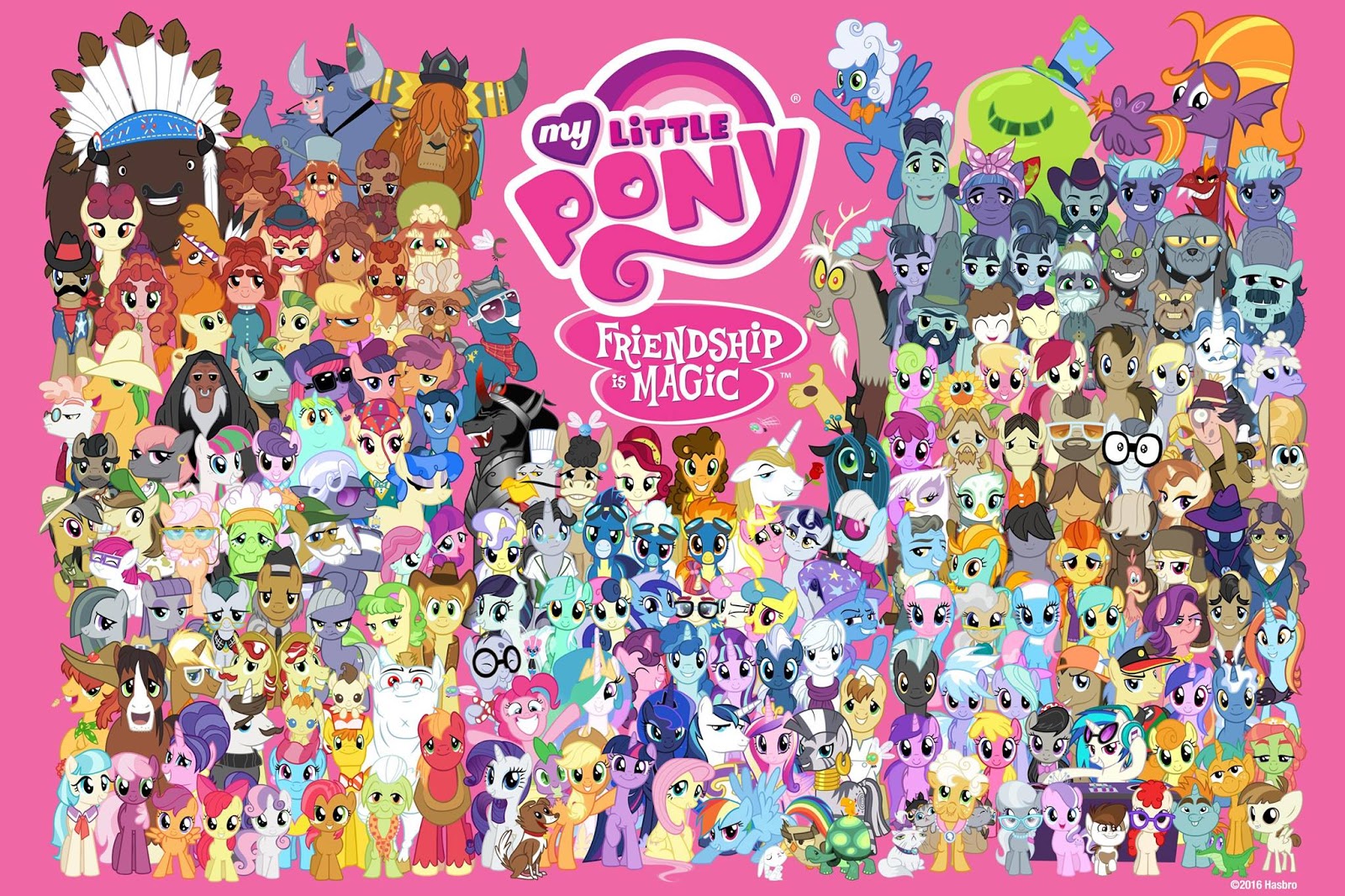
So you're interested by My Little Pony: Friendship is Magic, but don't quite want to watch all 117 episodes? Then NeoGAF's episode guide is for you! Episodes with titles written like this <<"like this" written in the recommended episode color>> and have story descriptions are recommended to watch, and boxed episodes with titles like this <<written like important episodes>> are episodes with important character introductions or story developments--skip them at your own risk. Many other episodes will have notes written like this <<written like notes>>. All episodes other than important ones list which characters receive focus in them. A total of 63 episodes (7/13 of the series) are recommended or important.

The real recommendation is to watch every episode, but other than that, I recommend starting out watching the episodes specified by this guide, and if you grow to like certain characters, check out other episodes tagged with them. There are several great episodes that just barely didn't make it on the list, such as season 5's "The One Where Pinkie Pie Knows" and "The Mane Attraction", so there's still plenty to see outside of the guide. Even episodes generally considered weak, like season 2's "The Mysterious Mare Do Well" and "Dragon Quest", have a lot of things to enjoy.

If you just want to check out a few episodes, season 1's "Dragonshy" and "Sonic Rainboom" are popular choices for first episodes. Alternatively, this is still a mostly episodic children's show, albeit with major changes every once in a while, so you could just start watching from the latest episode or whatever you catch on TV.

You could also just watch the important episodes, but that would miss the appeal of this show. Fans love the show for the ways the characters interact, how fun the slice of life stories can be, and most of all, how adorable it is. While the action-heavy two parters are enjoyable, they are best as an exception to how the show usually is. But above all else, this guide is designed to let you enjoy the show as you wish!
==

After writing that out, I don't think we should bother writing out how the guide was made.

And season 3 images.
The Crystal Empire
Magic Duel
Keep Calm and Flutter On
Sleepless in Ponyville

Equestria Girls (though I was tempted by this)

Season 4:
Princess Twilight Sparkle (alternative)
Castle Mane-ia (alternative)
Flight to the Finish
Rarity Takes Manehattan
Maud Pie
Testing Testing 1, 2, 3
Twilight's Kingdom - top image from second episode

Rainbow Rocks

Season 5:
Bloom & Gloom
The Lost Treasure of Griffonstone
Slice of Life (though I'd prefer this, with the logo removed)
Party Pooped (alternative)
Amending Fences
Canterlot Boutique
Rarity Investigates
Crusaders of the Lost Mark
Hearthbreakers
The Cutie Re-Mark

Friendship Games

EDIT: Also, Paullo, I'm considering showing the season 1 guide to an MLP topic on another board for feedback, unless you don't think it's ready yet.
 

PaulloDEC

Member
That text all looks good Sigma, and thanks for the alt images. I'll probably have a go at getting S3 done tonight.

By all means share the images around for feedback. I can't commit to too many more changes though; the PSDs are getting so complex now that even small changes to things like text results in multi-hour fixing sessions.

EDIT: S3 and S2 (with some replaced images):


S3 Ain't the prettiest in terms of layout, but not too sure what else I can do.

For S2, I went with all the suggestions except for Hurricane Fluttershy. The silhouette shot is cool in isolation, but it wasn't working so well as a small thumbnail.
 
Feedback about the season 1 guide from another forum is generally positive (minus some grumblings about episode choices), but some people there also find it odd that the "Party of One" picture is before "The Cutie Mark Chronicles". If it's not too much trouble, maybe you could try arranging the pictures in order. They are also confused as to what the text colors mean, but that's why we're putting in a legend at the top.

Season 2 looks good.

For season 3, I think a lot of the wonkiness can be solved by moving Equestria Girls lower, so that the image spacing matches the rest of season 3. This will also help show that it's separate from the rest of the series, though maybe also putting "~~~" above the title will help. I think you should use "Movie -" instead of "Movie:", since the other two movies have colons in the title. I don't think the movies should be tagged, to avoid questions of how to tag Sunset Shimmer and the Dougworld characters. In any case, Cadance is barely in the movie.

In other news, ED reminds me of one part of the early fandom I definitely don't want to come back: the fad of giving class presentations about MLP.

EDIT: Group picture!
It's mostly just vectors used for the previous group shots, but some people noticed that you can actually see Sapphire Shores' cutie mark now.
MLP%2BAll%2BSeasons%2BFacebook%2BPoster%2B-%2BSapphire%2BShores.jpg


... Kind of.
 

PaulloDEC

Member
Feedback about the season 1 guide from another forum is generally positive (minus some grumblings about episode choices), but some people there also find it odd that the "Party of One" picture is before "The Cutie Mark Chronicles". If it's not too much trouble, maybe you could try arranging the pictures in order. They are also confused as to what the text colors mean, but that's why we're putting in a legend at the top.

Okay yeah. So the thing about the out-of-order images was that it was done as safeguard for later seasons where there may not be enough room (or too much room) to put the episode images in without uglying up the layout, hence the numbers in the corner to match them with the episode.

I'll jump in tonight and see how it looks with the order fixed, but it might be wise to leave that change until S4 and S5 are done. Ultimately the guide is for new viewers who won't know or care about the proper order, so I don't think it counts as too high of priority.

Season 2 looks good.

For season 3, I think a lot of the wonkiness can be solved by moving Equestria Girls lower, so that the image spacing matches the rest of season 3. This will also help show that it's separate from the rest of the series, though maybe also putting "~~~" above the title will help. I think you should use "Movie -" instead of "Movie:", since the other two movies have colons in the title. I don't think the movies should be tagged, to avoid questions of how to tag Sunset Shimmer and the Dougworld characters. In any case, Cadance is barely in the movie.

I'll take a look at these changes tonight. The tagging was a copy-paste goof on my part, disregard that :p

EDIT: Okay, minor S3 tweaks and S4:

 
Those look good, but I still feel like the Equestria Girls sections should look visually distinct from the actual series, without making them seem like they're important to the series. Maybe you could actually switch around the image and text for the movies, so the image is on the left and the text is on the right.

Anyway, the end's in sight! All that's left is:
* Season 5.
* Introduction image.
* Modifications to Equestria Girls sections.
* Add the legend to the top of the season listings.
* Maybe switch around images in the season 1 listing.

OK, that's still a fair amount.

Anyway, about the intro post, we can use the image in the OT (source), except replacing the "official thread" part with "episode guide". Maybe also change the "welcome to" part if you can't find the matching font. Then, to the side of or below that image, put my introduction text. I'll message Myke about the fact that we're using his image for it.

Though, given that there shouldn't be a lot of messing around with different image elements like with the episode guides, I could probably do it myself if you want.

EDIT: Actually, thinking about it, OCs aren't exactly the best way to endear a potential new viewer. Unfortunately, it might be best to leave Belle Eve out. Well, I still sent a PM to Myke in case I change my mind.

I'll go ahead and make the intro post after all. Paullo, what font did you use for your images?

EDIT: I was going to ask for the background image, but I realized that at that point, it really would just be quicker to have you make the intro image. Just put my intro text onto that background, centered, with enough room around it to maybe put some show screenshots, and then I'll do any other editing.
 

PaulloDEC

Member
On mobile right now, but everything you said there sounds good. I'll take a look at distinguishing EG like you suggested later tonight.

I've got a long, long weekend coming up, so hopefully we can knock the whole thing out then. S5, a few tweaks, heading and intro page left.
 
Ah, I just noticed some mistakes. Season 4's "Pinkie Pride" is tagged with "Apple Family" instead of "Pinkie Pie". "Castle Mane-ia", season 2's "Lesson Zero", and season 1's "The Best Night Ever" also inconsistently use "Mane 6" instead of "Mane Six".

ED rounds up last year's PMVs, and there are some good ones I hadn't seen before, including in the honorable mentions.

ED highlights PONY.MOV, the controversial fan animation series. At first, it didn't sound right that it started in 2011, but I suppose it must have. I found the first video decently amusing, but lost interest once it got a storyline and focused more on turning the characters into messed up versions instead of just making dumb jokes, and especially once it started that dumb shed meme. The article doesn't mention it, but there was also a tumblr comic for it that had an ongoing story.

Weird pony product
1.JPG


I like ED's OCs, by the way.
ideas_by_nevaylin-d9osw6f.png
 

PaulloDEC

Member
Okay, here we go: updated versions of all five season pages:


Looking for typos, factual errors, inconsistencies in spelling/formatting, alternative picture suggestions, etc. Once these are all cleared I'll start looking at the header (which will be applied to all of these pages) and the separate intro page.

I think Belle Eve would be a great introduction for fellow GAFfers. YMMV, though, I suppose.

The guide isn't really intended for GAFfers specifically though, which is probably why Sigma was concerned. OCs aren't always welcomed with open-arms elsewhere, so I see his point.

Ah, I just noticed some mistakes. Season 4's "Pinkie Pride" is tagged with "Apple Family" instead of "Pinkie Pie". "Castle Mane-ia", season 2's "Lesson Zero", and season 1's "The Best Night Ever" also inconsistently use "Mane 6" instead of "Mane Six".

ED rounds up last year's PMVs, and there are some good ones I hadn't seen before, including in the honorable mentions.

Fixed those mistakes (I think). Some of those PMVs are great too, I haven't watched any in a while.
 

PaulloDEC

Member
Those "look back" animations are pretty neat. I've always liked that paper pony art-style.

On the guide, here's a first draft of the page header. I've got a night sky image behind it to distinguish it a bit from the rest of the document:


Bring on the feedback.
 
Uh, that header's pretty big. We already have an intro picture, so it really should just be "#5 --- Recommended (written in pink) --- Important (written in gold)". Something simple and to the point.

Just imagine how awkward it would be to scroll past that for every single season.
 

PaulloDEC

Member
GOLD episodes are IMPORTANT. You watch them for the plot.


Oh, you guys.

Uh, that header's pretty big. We already have an intro picture, so it really should just be "#5 --- Recommended (written in pink) --- Important (written in gold)". Something simple and to the point.

Just imagine how awkward it would be to scroll past that for every single season.

I can definitely make it smaller, but the thinking was that since we're doing these as separate images, each one ought to be self-contained in some sense. The internet being what it is, there's a good chance that if people do share this stuff around that pages may get left out.

Thoughts?

EDIT: Same idea, much more compact. Let me know what you think.

 
I've always imagined linking the images as an album, like on Imgur. I'm not sure if the site you're using allows that. In any case, I'll concede to the design you came up with, but I still feel that the "Season Five" part should be much smaller. I think the size you used for "(2015)" is good.
 

PaulloDEC

Member
I've always imagined linking the images as an album, like on Imgur. I'm not sure if the site you're using allows that. In any case, I'll concede to the design you came up with, but I still feel that the "Season Five" part should be much smaller. I think the size you used for "(2015)" is good.

Oh yeah, I was aware you wanted to set it up as an album, but you know what people are like. Stuff gets embedded, emailed, linked, resized, etc. I figured it was better to be prepared for that.

How's this for a compromise? I didn't want to go too small with the season number, as people may often see these as thumbnails before they see the full-size version, and they ought to be able to identify which season is which from that vantage.


PaulloDEC

Member
Cool.

Okay, so this next set will be our first release candidate. I've applied the headers (and corrected the year, as it turns out the first four seasons all aired across two years), so they should be content complete now.

I'll probably look through all five over the next day or two for any errors in the text, but if anyone else wants to help fact/spell/error check, please do so. I've already caught a few missing image tags (the little numbers in the corner).


PaulloDEC

Member
First draft of the intro page:


Not sure what you were thinking for this one Sigma, so hit me with any changes/ideas/suggestions.

Everything looks good, as far as I can tell.

Hasbro being sued by Font Brothers America over the font used in the "Friendship is Magic" part of the logo and other text. They will probably just reach a deal.

Pretty weird one, that. I can't imagine a company as large as Hasbro would use any font, especially for a wide-reaching brand like MLP, without exhaustive checking of licenses and permissions.
 

Cheerilee

Member
Everything looks good, as far as I can tell.

Hasbro being sued by Font Brothers America over the font used in the "Friendship is Magic" part of the logo and other text. They will probably just reach a deal.

In the EQD comments, someone points out that the Font Bros website says...

"Generation B is one of the official fonts used in the TV series My Little Pony: Friendship is Magic! Enjoy, my little Bronies!"

That line was removed from Font Bros website in the time between someone posting it on EQD and now. So at some point Hasbro and Font Bros had an official deal in place.


I would guess that the "Friendship is Magic" part of the logo was designed by Hasbro's graphic designers, based on the Generation B font, because it has a few slight differences. When it comes to the question of "How can I type in Pony?", Hasbro simply answers "Generation B".

I suspect that there are differences between Hasbro (or Font Bros) telling fans to use Generation B, and Hasbro using it as a default font on their website, and Hasbro using it for generic text on a package, and Hasbro using it in a copyrighted logo. Font Bros seems to be taking this complaint all the way to the top, and saying that they own the logo.


Oh and, also from the Font Bros website entry for the font...

"Inspired by the opening titles of the Walt Disney film, The Parent Trap (1961),"

LOL copyright.
 
The intro could probably use something to make it more colorful. Maybe a shot of each of the Mane Six from one of their recommended episodes along the sides (3 on each). I don't think you'd have to use the same dimensions as the other screenshots.

Twilight ("Friendship is Magic - Part 1")
Rainbow (season 1's "Sonic Rainboom")
Applejack (season 2's "Super Speedy etc.") (alt1, alt2)
Fluttershy (season 3's "Keep Calm and Flutter On") (alt)
Rarity (season 4's "Rarity Takes Manehattan") (alt1, alt2)
Pinkie (season 5's "The Lost Treasure of Griffonstone") (alt1, alt2)
 

PaulloDEC

Member
The intro could probably use something to make it more colorful. Maybe a shot of each of the Mane Six from one of their recommended episodes along the sides (3 on each). I don't think you'd have to use the same dimensions as the other screenshots.

Twilight ("Friendship is Magic - Part 1")
Rainbow (season 1's "Sonic Rainboom")
Applejack (season 2's "Super Speedy etc.") (alt1, alt2)
Fluttershy (season 3's "Keep Calm and Flutter On") (alt)
Rarity (season 4's "Rarity Takes Manehattan") (alt1, alt2)
Pinkie (season 5's "The Lost Treasure of Griffonstone") (alt1, alt2)

Okay, so I've got a good layout worked out now, but the only problem is that it perfectly fits five images, and using the Mane 6 means six images.

I wonder if maybe we could switch to a different set of pictures? I bet we could find five really good shots that include two of the Mane 6 together if you wanted to stick with them.

EDIT: For reference:

 
Well, if you insist on using that layout instead of expanding the width, then we could do character pairs, with Twilight + Spike and the CMC + any of the Mane Six (from "The Cutie Mark Chronicles"). I was going to suggest the fifth image be the group shot from the first opening, but I honestly think it's kind of weird-looking, and with five slots, I'd like to get one from every season. But then I checked, and the photo from the end of season 4 actually does hide Twilight's wings pretty well. And it actually includes Spike.

Twilight + Spike (season 3's "The Crystal Empire - Part 2")
Rarity + CMC (season 1's "The Cutie Mark Chronicles")
Rainbow + Fluttershy (season 2's "Super Speedy etc.") (I managed to get in blushing Fluttershy anyway)
Applejack + Pinkie (season 5's "Hearthbreakers") (alt)
"Twilight's Kingdom" group shot (season 4)
 

PaulloDEC

Member
Well, if you insist on using that layout instead of expanding the width, then we could do character pairs, with Twilight + Spike and the CMC + any of the Mane Six (from "The Cutie Mark Chronicles"). I was going to suggest the fifth image be the group shot from the first opening, but I honestly think it's kind of weird-looking, and with five slots, I'd like to get one from every season. But then I checked, and the photo from the end of season 4 actually does hide Twilight's wings pretty well. And it actually includes Spike.

Twilight + Spike (season 3's "The Crystal Empire - Part 2")
Rarity + CMC (season 1's "The Cutie Mark Chronicles")
Rainbow + Fluttershy (season 2's "Super Speedy etc.") (I managed to get in blushing Fluttershy anyway)
Applejack + Pinkie (season 5's "Hearthbreakers") (alt)
"Twilight's Kingdom" group shot (season 4)

If you've got a different idea for the layout, I'm totally open to suggestions! Feel free to upload a mockup for me to work from if you think it'd work better.
 
Nah, after looking at it more, I realize that having screenshots on the sides would make the image too wide. Besides, with this change, we get Spike and the CMC.
 

Orcastar

Member
I don't see what the problem is; if the layout fits five images, you should easily be able to fit all the main characters in.

I like AJ, but I just had to.
 

Cheerilee

Member
With five pictures, you could pick a representative from each season (so far). Maybe some villains?

Nightmare Moon
Discord
Sombra
Tirek
Starlight Glimmer
 

PaulloDEC

Member
Nah, after looking at it more, I realize that having screenshots on the sides would make the image too wide.

Alrighty, updated page:


Feedback, errors, blah blah blah.

With five pictures, you could pick a representative from each season (so far). Maybe some villains?

Nightmare Moon
Discord
Sombra
Tirek
Starlight Glimmer

I wouldn't be against this, though it might look a bit strange having the guide fronted by villains? Open to thoughts.

I don't see what the problem is; if the layout fits five images, you should easily be able to fit all the main characters in.

I like AJ, but I just had to.

 
Looks good to me.

I think that's a wrap, but I'll wait for more responses before sending it over to Equestria Daily. Does the site you're using allow for albums? If not, I'll make one on Imgur.
 

PaulloDEC

Member
Looks good to me.

I think that's a wrap, but I'll wait for more responses before sending it over to Equestria Daily. Does the site you're using allow for albums? If not, I'll make one on Imgur.

Righto.

If we end up with no further changes, you'll find the final files HERE. I'll let you sort out the album stuff, I'm not too knowledgable there.
 
Top Bottom