Thanks!
Yeah, it was a bit of a rush job. Once the music has been scored and I've finished polishing it I'll post up a proper video! ...
I see.
... Funnily enough though, it actually looks better when quoted and shrunk slightly. ...
That's because the image gets filtered while adding shades which aren't in the
palette. Looks better, but there is a downside to scaling dithered images, i.e.
they usually produce much more objectionable patterns when being scaled.
This situation could be alleviated. If it's know that the image was dithered,
then one can apply a specific dithering removal algorithm trying to reproduce
the "continuous" shades again. With the pattern removed one can scale the
image without the issues indicated above. But there is a problem when wanting
to apply such an algorithm, for, such algorithms usually need to know which
dithering technique was used for the image.
That is to say, if we could flag within a gif what dithering technique was
used, we could remove the dithering when displaying the animation leading to
an improved image quality esp. when you wanna scale them down. Just an idea.
... If only someone had an advanced GIF tool with many options, eh!?
")
Still considering.
You know, one usually thinks that larger dither patterns like 8x8 Bayer for
example is pretty good, which it actually is, technically, because it is known
that about 64 shades are enough to reproduce continouse tone for the eyes from
dithering between black and white. Nice as it seems, there is a disadvanage.
What isn't know is that the resolution (definition to be more precise) of the
image decreases in inverse proportion with the increase of halftone shades. So
if we have a few more true shades than just black and white (which usually is
the case), we don't need that much dithering and will as such preserve more of
the resolution when using a smaller pattern (like a 4x4 or even 2x2). The goal
is to try to reproduce as much true shades as possible (good quantization) and
use the smallest but least objectionable pattern which still covers the bands
sufficiently.
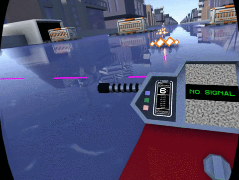
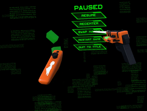
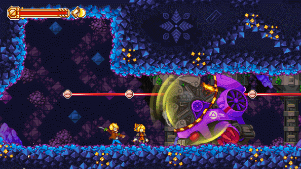
The SSR issues at the borders are less noticeable in VR, I think, but you can catch it if you're looking for it. That's a good suggestion, though! I'll have to toy with the material later.
If you have some performence left you may also try some faint gloss making it
even harder to tell the difference. Fresnel + some faint gloss would help to
tone down the hard mirror reflection you have, which, in my book, clutters the
screen a bit too much.